
As a health and medicine news outlet, STAT’s stories lend themselves to data journalism pretty well. Data journalism is about using data, usually, large amounts of it, to visualize and tell a story that’s otherwise inscrutable, buried deep within spreadsheets. Through data journalism, investigators can reveal stories of great importance to the well-being of the public, like STAT’s recently published clinical trial investigation showing how some clinical trials did not report necessary data to the NIH.
Regarding this most recent investigation, STAT was very transparent about the process, publishing an article about how the journalists analyzed the data and how they obtained it. Personally, I think this is a great idea. Not only does it provide readers with the evidence they need to trust the investigation, but it also serves as a learning tool for aspiring data journalists.
I was able to find five other instances of data journalism on the site, ranging from an earlier investigation of clinical trials to an interactive global history of Zika virus. The Zika article gives users a visual way to understand the history of Zika. Users can click on the pink-colored countries on an interactive globe and a text box on the side will detail the latest Zika outbreak in that country. This is a solid example of how a visual interactive can add to or even be the story.
[media-credit name=”Talia Bronshtein” link=”https://www.statnews.com/2016/03/25/zika-globe-interactive/” align=”aligncenter” width=”282″]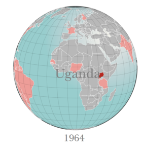 [/media-credit]
In another instance, STAT developed the data themselves by partnering with Harvard to poll 1,006 Americans on their opinions of faster drug approvals. In the article, STAT displayed the results in an interactive graph. But the interactivity didn’t add much to the story. The display is a simple bar graph and the text labeling the graph just jumps out a little more when you mouse over it.
STAT has also used data and interactives to explore the opioid epidemic. In one article, STAT shows how illegal drugs have become cheaper and more potent over time. An interactive graph (shown in the cover photo of this post) allows users to look at the price and purity of popular illicit drugs from 1986 to 2012. STAT doesn’t let the interactive do all of the talking, though, and accompanies the visuals with detailed written explanations. Another example, shown below, uses CDC data to show what drugs have been causing overdoses in recent years.
STAT creates some pretty engaging interactives with their data journalism, using their tools to visualize and illuminate the significance of the numbers in medicine and health.